OPTIMIZED ANAGLYPH
This article describes the functionality and advantages of using optimized anaglyph compared to default anaglyph, as it is presented here. The optimized anaglyph algorithm (developed by Peter Wimmer from 3dtv) displays anaglyph imagery, with only very little to no retinal rivalry. It also corrects most colors to look more like they should. Strong primary colors however, will look very different (especially red).
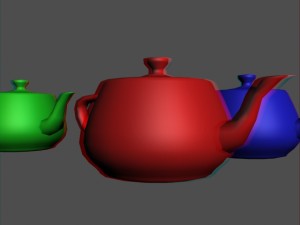
To explain the benefits more in depth, let’s start by looking at a classical anaglyph image first. I have created a couple of teapots in 3dsmax and rendered them with my stereoscopic camera:

standard anaglyph image
If you look at this anaglyph image you will see a good amount of flickering, which get’s so disturbing that it’s hurting the 3d-effect. This flickering is called retinal rivalry and is caused by the way anaglyph images are composed: You take the red channel from one image and blend it with the blue and green channels from the other image. The effect: Each eye can only see one part of the image BUT, one eye gets to see two channels while the other one gets only one. This is very unnatural to our eyes and will result in flickering and headaches.
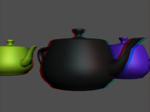
So the first step is to take not only the red components from the left image but get two channels as well, and mix them to a red channel. This will mess up the colors but reduces eye strain quite a bit.

first anaglyph correction
But another problem occured. The front teapot has suddenly become pitch black. Why is that? Because we haven’t considered the red channel at all. The image used green and blue instead. So now there’s no color information at the red parts of the image and they will be shown black.
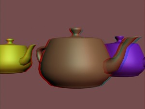
To get rid of this effect the algorithm maps the red channel either to blue or green, or to mixture of both. It does that by comparing the red value and the green/blue value and choosing the stronger one plus multiplying it with a variable. It’s the storytellers choice wether he wants the image to be more blueish or greenish, or to stick with a mixture.

You’ll notice that the red has become a beige color. Beige is clearly not red, but it reads very well in stereo and is way better then black. You’ll also notice that the image has become more redish. This is again due to the 2 channels vs. 1 channel problem. Since one eye get’s only half as much color (which is light), as the other one, the red channel should be brightened. A gamma correction is able to brighten the red channel while remaining it’s contrast.
If you want to see your images in optimized anaglyph download my optimized anaglyph filters for adobe, or download/buy the amazing stereoscopic player from 3dtv.at. Hope you enjoyed this article.
Am 16. Januar 2010 um 18:50 Uhr
Hey Dave,
great article!
Describes the whole problem really nice.
Thanks for that!
P.S.: It would be nice, if you just could copy and paste the formulas for normal and optimized anaglyph beneath the images.
So newbies can follow you more easily.